top of page


Pickle & Corn Identity
Client:
Joceline Yan
Year:
2023
Project Type:
Branding, Identity
Role:
Designer
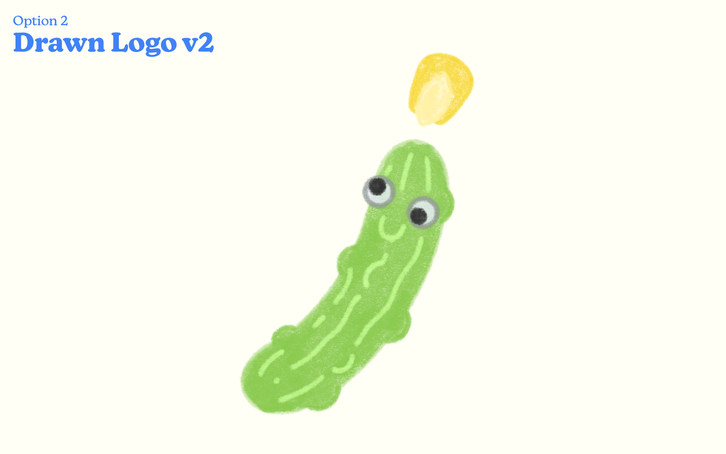
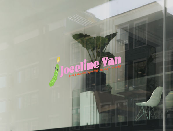
The brief for this logo design was quite a great one - the letter 'J' but using a pickle & a corn as the base. The logo went through a couple of iterations, from an uppercase J, lowercase J to using a bisected ear of corn to using a whole cob. We settled on a simple lowercase 'j' with a kernal as the tittle to not over complicate the whole thing. The googly eyes were a last minute (but amazing) addition & direction from the client.
bottom of page


